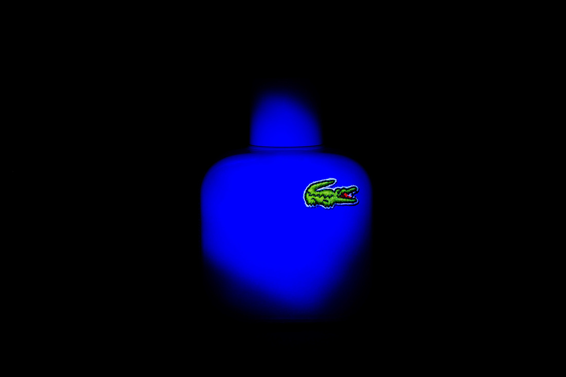
This image was actually three images put together in photoshop. The first image was of the Lacoste bottle which I just needed a plain image of to contrast against the UV light. I took this in my light box an used just the overhead light. The second image is the background, for this I used a long exposure and a UV light which I painted around the back of subject to highlight the bottle. The third image is the foreground where I again used a long exposure to paint the black Perspex tile to give a much more even finish. To finalize the image I adjusted the crop to make sure it was central and I then removed any dust spots using the clone stamp tool. After I had finished in photoshop I used adobe lightroom to increase the contrast and brightness of the badge to make it pop.
Improvements:
I would maybe try to light the front of the bottle more as it is a little bit dark. I would also put the the bottle top on straight.
Improvements:
I would maybe try to light the front of the bottle more as it is a little bit dark. I would also put the the bottle top on straight.

To create this image I used an A2 piece of matte black paper to reduce reflections and to give the effect of an endless abyss. To light the bottle I used a torch to shine straight on to the subject to show it emerging from the darkness. I then used photoshop to remove any dust spots and adobe lightroom to boost the contrast to make the colour pop.
In this series of images I used a lamp with a diffuser to light to light the subjects from one side to create shadows. I also used a black perspex tile to create the desired reflection.


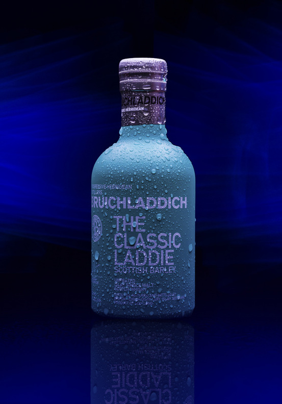
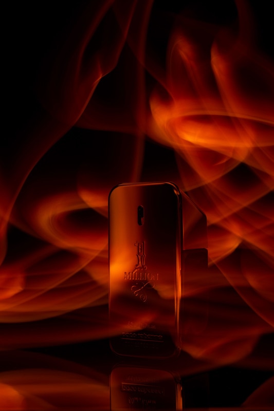
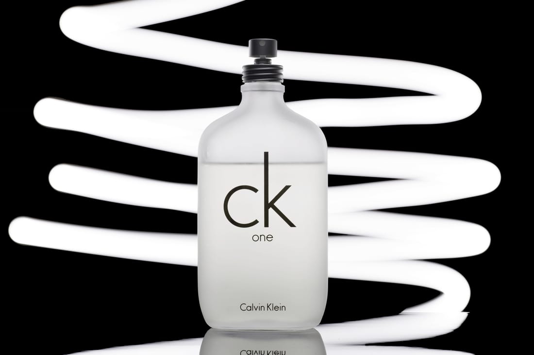
To create this image I lit just the top of the bottle to accent the shoulders of the bottle. I used a black Perspex tile to create a faint reflection from the bottle. To create the blue light in the back and foreground I used a UV light and aimed it towards the black backboard. I then took another exposure where I painted the light on to the Perspex tile. This one image is actually three images merged into one using photoshop.
Improvements:
I would go back and light the bottle from the front as well as the top as the lower front of the bottle is a little dark.
Improvements:
I would go back and light the bottle from the front as well as the top as the lower front of the bottle is a little dark.
To create this image I used a flash and a large piece of white card to bounce the light off onto the subject. This bottle was difficult to light as the surface is so reflective and it took several attempts of adjusting the flash and card to get the light even on the bottle. I them used lightroom to remove any dust spots and straighten the mage.
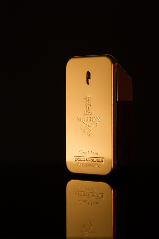
Improvements:
I would use a torch to light paint to swirls around the bottle in an almost christmas tree shape. To recreate the gold I would put yellow tissue paper over the light to match the golden bottle.
Improvements:
I would use a torch to light paint to swirls around the bottle in an almost christmas tree shape. To recreate the gold I would put yellow tissue paper over the light to match the golden bottle.
This image came about with a lot of trial and error. I started by trying to improve the image above but found it didn't look as I intended. I eventually layered the yellow tissue paper so thickly over the torch it turned into a orange and became quite a thin light. This turned out well as it looks almost fiery.
In these images I didn't use a lightbox I used just a coloured piece of card as the background and a flash firing against a large piece of white card to soften the light. I took these to break up the the larger pictures.


To create this affect I put my camera on a timed shutter so I could use both my hands to fire the party popper. This took 15 attempts. To light the subject i used a just a flash and a pice of card as glass bottles are very diffivult to light. I then removed as much dust as i could in photoshop.
Improvements:
I woud find a better composition as I don't think this one portrays the confetti explosion in the best way.
Improvements:
I woud find a better composition as I don't think this one portrays the confetti explosion in the best way.

In these images I didn't use a light box I used just a coloured piece of card as the background and a flash firing against a large piece of white card to soften the light. I took these to break up the the larger pictures


This image is quite basic in terms of lighting as all I used was a flash and bouncing it of a large piece of white card to diffuse the light.
Improvements:
I would try different compositions to find a more dynamic image. I would probably go back and try to make the confetti look like it is exploding more realistically.
Improvements:
I would try different compositions to find a more dynamic image. I would probably go back and try to make the confetti look like it is exploding more realistically.

In these images I didn't use a light box I used just a coloured piece of card as the background and a flash firing against a large piece of white card to soften the light. I took these to break up the the larger pictures.
Improvements:
Use a large piece of card to reflect the light back to create less shadow. This will make it look a little brighter.
Improvements:
Use a large piece of card to reflect the light back to create less shadow. This will make it look a little brighter.


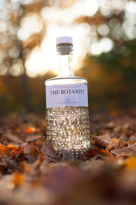
To capture this image I went to my local forest just before sunset to capture the golden light illumintate the bottle. The leaves in the background diffused a lot of the light but a hot spot was still created. I did some light enhancements to this image in lightroom to increase the warmth and brightness of the foreground.
Impovements:
To imporve this image I would remove the back labels before I had taken the picture as they create an unflattering shadow.
Impovements:
To imporve this image I would remove the back labels before I had taken the picture as they create an unflattering shadow.
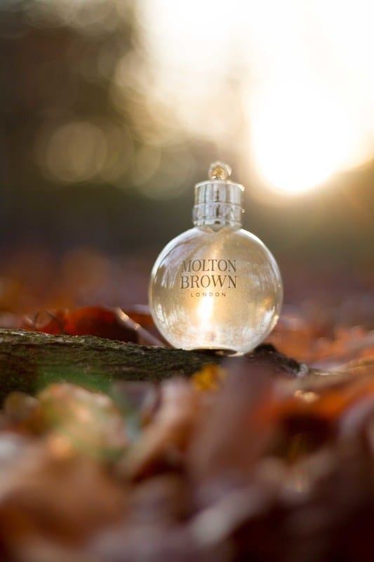
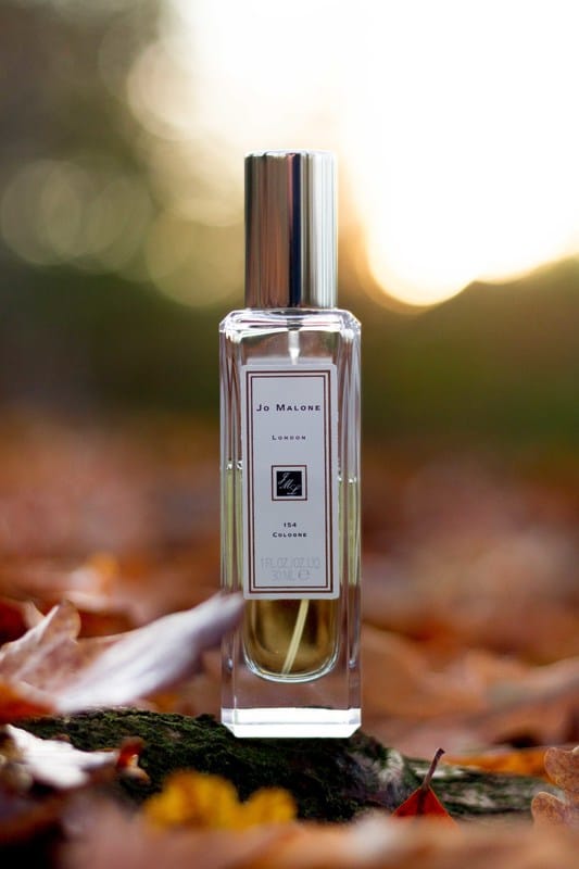
These images were taken just before sunset in my local forest. I used transparent bottles to let the golden light beam through. I chose a head on composition for the Jo Malone bottle and a low composition for the Molton Brown to make you feel as if you are amongst the leaves.
|
|
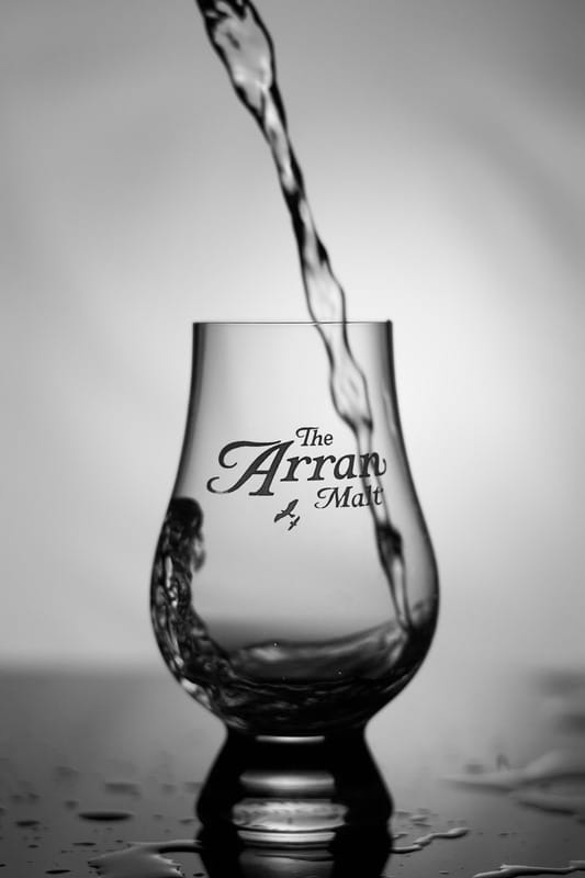
To create this image I put a large piece of very transparent card behind the glass and then used a desk lamp to light the card. This created a large diffused light behind the subject to create an almost silhouette-esk style. I used a small aperture on this picture to isolate the logo as this is the interest in the image. Also used a high shutter speed to catch the splash effect in the inside of the glass as this adds to the image.
Improvements:
I would wipe the water before off the perspex tile before every picture to give the image a cleaner look.
Improvements:
I would wipe the water before off the perspex tile before every picture to give the image a cleaner look.
I created this image by using a small torch to paint behind the bottle, and as the glass was frosted so there wasn't any problems with over exposed spots from the reflection of the glass which would be expected from transparent glass. The torch not only acted as the background but also lit the bottle pretty well. I then retouched the image in photoshop to remove any dust spots or finger prints. In the early images I took of this bottle I had problems with my hand being reflected and a pink-ish blur being shown in the background. To counteract this I put a black glove on to hide my skin.
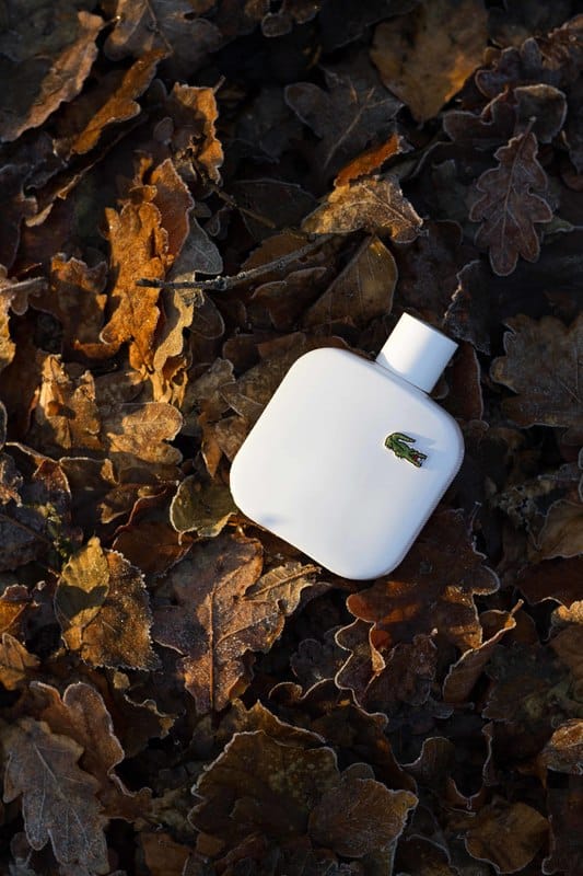
I took this picture just before sunset on a very frosty day. The white bottle ties in with the white frost lined leaves. I tried a
few different compositions but I think portrait works the best. The golden light creates lots of shadows which I believe add to the picture. I didn't need to do any retouching in lightroom or photoshop.
few different compositions but I think portrait works the best. The golden light creates lots of shadows which I believe add to the picture. I didn't need to do any retouching in lightroom or photoshop.
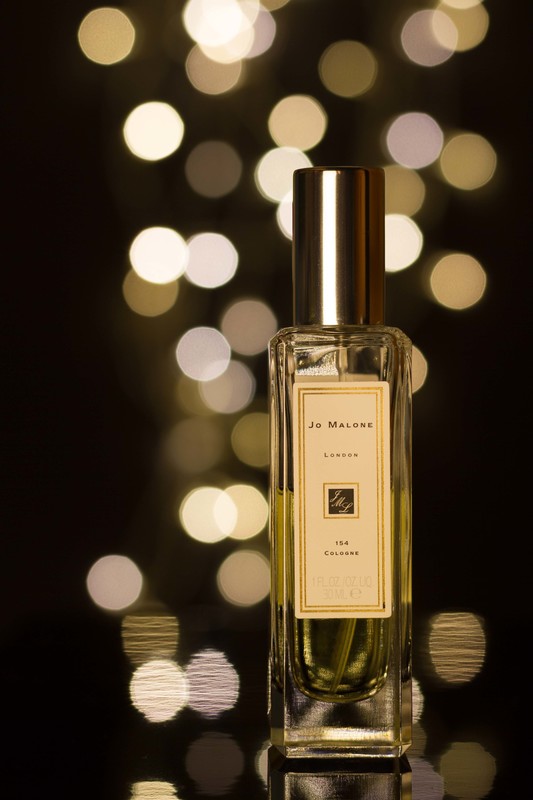
In this image I used a technique called bokeh. This is this done by using a small aperture to create light spheres. I used fairy lights and a black piece of card to create the background of this image. to light the front I used a basic desk lamp with a large piece of tissue paper hanging of the lightbulb to diffuse it. This work quite well as the warmth of the desk lamp matched the warmth of the fairy lights.
Improvements:
I would use a larger lens/telephoto to give the image more compression as I think it would look slightly better.
Improvements:
I would use a larger lens/telephoto to give the image more compression as I think it would look slightly better.